

1 Dart语法基础
- dart语言文件后缀以.dart结尾
- dart文件的入口方法为main方法
- dart文件中绝大部分语句都需要加分号结尾,像 ‘{ }’ 后通常不加分号
1.1 Dart的变量和常量
Dart的变量采用关键字var来声明
var age = 21;
var age = 20 + 21;
var变量声明的类型由第一次赋值来声明,后面不允许修改
Dart的常量声明有两种关键字const和final
- const是代码编译前被确定,不允许表达式中有变量存在,必须为常量或者固定值
- final变量在运行时被初始化,其值设置后不可更改
const pi = 3.1415926;
const length = 2 * num * 10;

final time = DateTime.now();
1.2 Dart的常用数据类型
1.2.1 字符串String
当我们需要用一个变量来描述一段文本,就可以使用String来声明
引号支持双引号或者单引号,支持拼接及模板字符串(使用${}处理表达式或$变量名来处理变量)
String text = 'Hello World';
String text2 = "我要在${DateTime.now()}吃早饭";
String text3 = "输出$text";
1.2.2 数字类型
当我们需要描述一个数字类型的时候,可以选择int/num/double
- int:整型数字
- num:可以整型也可小鼠数
- double:小数
int frindCount = 3;
double appleCount 3.4;
num rest = 1.5;
三个类型直接的转换关系如下:
// frindCount = appleCount 			// int 和 double不允许直接赋值
frintCount = appleCount.toInt();
appleCount = frindCount.toDouble();
appleCount = rest.toDouble();
rest = appleCount;
appleCount = rest.toDouble()
1.2.3 布尔类型bool
当我们需要一个属性来表示当前为真(true)或假(false)的时候,需要使用bool关键字声明
bool isFinishWork = false;
1.2.4 列表类型List
当一个变量需要存储多个值的时候,可以使用列表类型List
List students = ["张三", "李四", "王五", 123, true];
列表类型的常用操作有
- add:在尾部添加
- addAll:在尾部添加一个列表
- removeLast:删除最后一个
- remove:删除满足内容的第一个
- removeRange:删除索引范围内的数据(左闭右开区间)
- forEach:循环
- every:是否都满足条件
- where:筛选
- length:长度(属性)
- first:第一个元素(属性)
- last:最后一个元素(属性)
- isEmpty:是否为空(属性)
List students = ["张三", "李四", "王五"];
students.add("新同学");
students.addAll(["新同学1", "新同学2"]);
students.remove("新同学");
students.removeLast();
students.removeRange(1, 2);

print(students.length;
print(students.first);
print(students.last);
print(students.isEmpty);

students.forEach((item) {
    print(item);
});

bool match = students.every((item) {
    return item.toString().startsWith("新");
});

students.where((item) {
    return item.toString().startsWith("新");
}).toList();
1.2.5 字典类型Map
Map transMap = {"lunch": "午饭", "morning": "早上", "hello": "你好"};
print(transMap["hello"]);
transMap["hello"] = "早啊";
print(transMap["hello"]);
字典的常用操作有
- forEach:循环
- addAll:添加字典
- containsKey:是否包含某个Key
- remove:删除某个Key
- clear:清空
Map transMap = {"lunch": "午饭", "morning": "早上", "hello": "你好"};
transMap.forEach((key, value) {
    print('$key,$value');
});
transMap.addAll({"fine": "好"});
transMap.containsKey("fine");
transMap.remove("fine");
transMap.clear()
1.2.6 动态类型dynamic
Dart语言中,dynamic用来声明动态类型,允许变量运行时自由改变类型, 同时绕过编译时的静态检查
dynamic free = 1;
free = "";
free = false;
free = [];
free = {};
- dynamic: 运行时可自由改变类型,无编译检查,方法和属性直接调用
- var: 根据初始值进行推断类型,确定类型后类型确定,有编译检查,仅限推断的属性和方法
1.3 Dart的空安全机制
在Dart语言中,通过编译静态检查将运行时空指针提前暴露,将空指针异常从运行时提前至编译时,减少线上崩溃,并提供一系列空安全操作符
| 操作符 | 符号 | 作用 | 示例 |
|---|---|---|---|
| 可空类型 | ? |
声明可空变量 | String? |
| 安全访问 | ?. |
对象为null时跳过操作,返回null | user?.name |
| 非空断言 | !. |
开发者保证为空(否则运行时崩溃) | name!.length |
| 空合并 | ?? |
左侧为null时返回右侧默认值 | name ?? “Guest” |
String? username = null;
username?.startsWith("新");
// username = "张三";
username!.startsWith("新");
String displayName = username ?? "张三";
1.4 Dart的运算符
在Dart语言中,对数字进行加减乘除运算采用算术运算符
| 运算符 | 作用 |
|---|---|
| + | 加 |
| - | 减 |
| * | 乘 |
| / | 除 |
| ~/ | 整除 |
| % | 取余数 |
在Dart语言中,对数据进行赋值运算采用赋值运算符
| 运算符 | 作用 |
|---|---|
| = | 赋值 |
| += | 加等 |
| -= | 减等 |
| *= | 乘等 |
| /= | 除等 |
在Dart语言中,对数值进行比较操作实用比较运算符,比较运算符的结果都是布尔类型
| 运算符 | 作用 |
|---|---|
| == | 判断是否相等 |
| != | 判断两个值是否不等 |
| > | 判断左侧值是否大于右侧值 |
| >= | 判断左侧值是否大于等于右侧值 |
| < | 判断左侧值是否小于右侧值 |
| <= | 判断左侧值是否小于等于右侧值 |
在Dart语言中,需要对于bool类型的值进行逻辑运算,需要使用逻辑运算符,使用逻辑运算符必须保证参与的变量为布尔类型
| 运算符 | 作用 |
|---|---|
| && | 逻辑与,a && b, a和b同时true,得true |
| || | 逻辑或,a | | b,a和b有一个true,得true |
| ! | 逻辑非,!a,对a变量进行取反 |
1.5 Dart的流程控制
- if分支语句
if (score >= 60) {
    print("及格");
} else {
    print("寄");
}
- 三元运算符
print(score >= 60? "及格": "寄");
- switch/case
switch (state) {
    case 1:
        print("待付款");
        break;
    case 2:
        print("代发货");
        break;
    case 3:
        print("待收货");
        break;
    default:
        print("????");
}
- while
while (index < foods.length) {
    if (index == 2) {
        continue;
        // break;
    }
    print(foods[index]);
    index += 1;
}
- for
for (int i = 0; i < 10; i++) {
    print(foods[i]);
}
1.6 Dart的函数
在Dart语言中,函数是代码组合和复用的核心单元
int add(int a, int b) {
    return a + b;
}
1.6.1 函数返回值
函数的返回值包括分为有返回值和无返回值
- 有返回值:
具体类型 函数名称() {} - 无返回值:
void 函数名称() {}
int add(int a, int b) {
    return a + b;
}

add(int a, int b) {
    return a + b;
}

void add(int a, int b) {
    print(a + b);
}
返回值类型可省略,Dart会自动推断类型为dynamic。明确返回值类型是更推荐的编程习惯
1.6.2 可选位置参数
可选位置参数必须位于必传参数后面, 采用中括号包裹,可选参数可以设置默认值
String combile(String a, [String? b = "b", String? c = "c"]) {
    return a + b + c;
}
1.6.3 可选命名参数
可选命名参数必须位于必传参数后面, 采用大括号包裹,可选参数可以设置默认值
void showPerson(String username, {int? age = 10, String? sex = "男"}) {
    print('姓名:$username, 年龄: $age, 性别: $sex');
}
1.6.4 匿名函数
可以声明一个没有名称的函数赋值给变量,进行调用
Function  test = () {
    print("测试");
}

void onTest(Function callBack) {
    callBack();
}
1.6.5 箭头函数
当函数体只有一行代码时,可以使用箭头函数编写,使用箭头函数可以省略return关键字
int add(int a, int b) => a + b;
1.7 Dart的类
Dart语言中,类(class)是面向对象编程的核心,类包含属性和方法来定义对象的行为和状态
void main() {
    Person p = Person();
    p.name = "老高";
    p.age = 35;
    p.study();
}

class Person {
    String name = "";
    int age = 0;
    String sex = "男";

    void study() {
        print('$name在学习');
    }
}
1.7.1 默认构造函数
实例化对象的时候,使用构造函数直接给对象中的属性赋值
void main() {
    Person p = Person(name: '张三');
    p.study();
}

class Person {
    String? name;
    int? age;
    String? sex;

    Person({String? name, int? age, String? sex}) {
        this.name = name;
        this.age = age;
        this.sex = sex;
    }

    void study() {
        print('$name在学习');
    }
}
1.7.2 命名构造函数
构造函数可以采用命名的方式,返回一个实例化对象
默认构造函数和命名构造函数可同时存在
void main() {
    Person p = Person.createPerson(name: '张三');
    p.study();
}

class Person {
    String? name;
    int? age;
    String? sex;

    Person.createPerson({String? name, int? age, String? sex}) {
        this.name = name;
        this.age = age;
        this.sex = sex;
    }

    void study() {
        print('$name在学习');
    }
}
1.7.3 构造函数语法糖
同名构造函数和命名构造函数都支持简写写法
class Person {
    String? name;
    int? age;
    String? sex;

    Persion({this.name, this.age, this.sex});
    Person.createPerson({this.name, this.age, this.sex});

    void study() {
        print('$name在学习');
    }
}
1.7.4 公有属性和私有属性
私有属性以下划线开头, 如_name,其余均为公有属性
- 公有属性,提供自身或者其他外部文件和类使用的属性和方法
- 私有属性,仅供自身使用的属性和方法,其他外部文件和类无法访问
class Person {
    String? _name;
    int? _age;
    String? _sex;

    Person.createPerson({String? name, int? age, String? sex}) {
        this._name = name;
        this._age = age;
        this._sex = sex;
    }

    void study() {
        print('$name在学习');
    }
}
1.7.5 类的继承
继承是拥有父类的属性和方法,使用关键字extend
- dart属于单继承,一个类只能拥有一个直接父类, 子类拥有父类所有的属性和方法
- 子类不会继承父类构造函数,子类必须通过super关键字调用父类构造函数确保父类正确初始化
- 子类可通过@override注解重写父类方法,扩展其行为
class Child extends Parent {
    Child({String? name, int? age}): super(name: name, age: age);

    @override
    void study() {
        print('$name子类学习');
    }
}
1.7.6 Dart中类的多态
Dart中的类的是指同一操作作用于不同的对象,可以产生不同的执行效果
class PayBase {
    pay() {
        print("基础支付");
    }
}

class WxPay extends PayBase {
    @override
    pay() {
        print("微信支付");
    }
}


class AliPay extends PayBase {
    @override
    pay() {
        print("支付宝支付");
    }
}
1.7.7 抽象类和接口实现
- 使用abstract关键字声明一个抽象类(没有实现体)
- 使用implements关键字继承并实现抽象类
abstract class PayBase {
    void pay();
}

class WxPay implements PayBase {
    @override
    void pay() {
        print("微信支付");
    }
}


class AliPay implements PayBase {
    @override
    void pay() {
        print("支付宝支付");
    }
}
1.7.8 类的混入
Dart允许在不使用传统继承的情况下,向类中添加新的功能
- 使用mixin关键字定义一个对象
- 使用with关键字将定义的对象混入到当前对象
- 一个类支持with多个mixin,调用优先级遵循“后来居上”原则,即后混入的会覆盖先混入的同名方法
mixin BASE {
  void song(String name) {
    print("$name会唱歌");
  }
}

class Student with BASE {
  String name;
  int age;
  Student(this.name, this.age);
}

class Teacher with BASE {
  String name;
  int age;
  Teacher(this.name, this.age);
}
1.7.9 泛型
Dart允许使用类型参数,限定类型的同时又让类型更加灵活,让代码更加健壮和维护性更强
class Student<T>  {
    T? name;
    int? age;
}

void printList<T>(List<T> list) {
    list.forEach(print);
}
1.8 Dart的异步编程
Dart是单线程语言,即同时只能做一件事,遇到耗时任务就会造成程序阻塞,此时需要异步编程
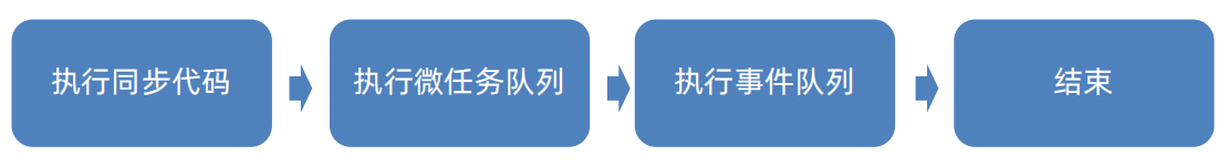
1.8.1 事件循环
Dart中异步任务包含:
- 微任务队列:Future.microtask()
- 事件队列:Future、Future.delayed()、I/O操作等
Dart采用单线程 + 事件循环的机制完成耗时任务的处理
1.8.2 Future
Future代表一个异步操作的最终结果,他有三种状态:
- Uncompleted(等待)
- Completed with a value (成功):不抛出异常-成功状态-
then(() {}) - Completed with a error(失败):throw Exception()-失败状态-
catchError(() {})
Future f = Future(() {
    // return "Hello Flutter";
    throw "出错了";
});

f.then((value) {
    print(value);
});

f.catchError((e) {
    print("出错了");
});
Future可以通过链式的方式连续得到异步的结果
Future f = Future(() {
    return "Hello Flutter";
    // throw "出错了";
  }).then((value) {
    return Future(() => "test1");
  }).then((value) {
    return Future(() => "test2");
  }).then((value) => {
    print(value)
  }).catchError((e) {
    print("出错了");
  });
1.8.3 async/await
除了通过then/catchError的方式,还可以通过async/await来实现异步编程,await 总是等到后面的Future执行成功,才执行下方逻辑,async必须配套await出现
void test() async {
  try {
    await Future(() {
      throw Exception();
    });
  } catch (e, s) {
    print("出错了");
  }
}
2 Flutter框架核心
这里我们以Web环境为例子
2.1 Flutter开发环境搭建
从Github获取Flutter
务必将flutter包下载到英文目录下
git clone https://github.com/flutter/flutter.git
设置环境变量Path到${FLUTTER_DIR}\bin
国内可以使用镜像加速,添加环境变量PUB_HOSTED_URL和FLUTTER_STORAGE_BASE_URL,可用源如下
| 提供商 | PUB_HOSTED_URL | FLUTTER_STORAGE_BASE_URL |
|---|---|---|
| 上海交大 | https://mirror.sjtu.edu.cn/dart-pub | https://mirror.sjtu.edu.cn |
| 清华大学 | https://mirrors.tuna.tsinghua.edu.cn/dart-pub | https://mirrors.tuna.tsinghua.edu.cn |
| Flutter中国(七牛云) | https://pub.flutter-io.cn | https://storage.flutter-io.cn |
| 腾讯云 | https://mirrors.cloud.tencent.com/dart-pub | https://mirrors.cloud.tencent.com |
2.2 创建Flutter项目
使用命令创建Flutter工程
flutter create --platforms web <项目名称>
目录结构如下
flutter_demo/
├── .dart_tool/				 # Dart工具生成的文件和缓存
├── build/        			 # 构建产物目录
├── android/                 # Android 原生代码相关配置及源码ty 入口文件
├── ios/                     # iOS 原生代码相关配置及源码
├── web/          			 # Web 平台相关配置及源码
├── lib/                     # Flutter 应用的主要 Dart 代码目录
│   ├── main.dart            # Flutter 应用入口文件
│   └── ...                  # 其他业务逻辑和 UI 相关 dart 文件
├── test/                    # 测试代码存放目录(单元测试、widget 测试等)
├── metadata/				 # Flutter 项目标实文件(自动生成)
├── analysis_options.yaml	 # 配置静态代码分析工具
├── pubspec.yaml             # Flutter 项目的配置文件,定义依赖、资源等
└── README.md                # 项目说明文档
运行lib目录下的main.dart即可
2.3 启动文件说明
查看main.dart文件内容,如下
import 'package:flutter/material.dart';

void main() {
  runApp(const MyApp());
}

class MyApp extends StatelessWidget {
  const MyApp({super.key});

  ......
}

......
- runApp函数是Flutter内部提供的一个函数,启动一个Flutter应用就是从调用这个函数开始的
- runApp需要传入Widget,Widget表示控件、组件、部件的含义, Flutter中万物皆Widget
Flutter的默认有Material库,Material是Google公司推行的一套设计风格,有很多的设计规范,如颜色、文字排版、动画等
2.4 Flutter基础组件
2.4.1 MaterialApp
整个应用被MaterialApp包裹,方便我们对整个应用的属性进行整体设计,常见属性有title,theme和home
- title: 用来展示窗口的标题内容(可以不设置)
- theme:用来设置整个应用的主题
- home: 用来展示窗口的主体内容
import 'package:flutter/material.dart';

void main(List<String> args) {
  runApp(MaterialApp(
    title: "Flutter Demo",
    theme: ThemeData(scaffoldBackgroundColor: Colors.blue),
    home: Scaffold(),
  ));
}
2.4.2 Scaffold
Scaffold: 用于构建Material Design风格页面的核心布局组件,提供标准、灵活配置的页面骨架
| 属性 | 主要作用说明 |
|---|---|
| appBar | 页面顶部的应用栏,通常用于显示标题、导航按钮和操作菜单 |
| body | 页面的主要区域,可以放置任何其他组件,是页面的核心 |
| bottomNavigationBar | 底部导航栏,方便用户在不同核心功能页面间切换 |
| backgroundColor | 设置整个Scaffold的背景颜色 |
| floatingActionButton | 悬浮操作按钮,常用于触发页面的主要动作 |
import 'package:flutter/material.dart';

void main(List<String> args) {
  runApp(MaterialApp(
    title: "Flutter Demo",
    theme: ThemeData(scaffoldBackgroundColor: Colors.blue),
    home: Scaffold(
      appBar: AppBar(
        title: Text("Flutter Demo"),
        centerTitle: true,
      ),
      body: Center(
        child: Text("Hello Flutter"),
      ),
      bottomNavigationBar: BottomNavigationBar(
        items: [
          BottomNavigationBarItem(
            icon: Icon(Icons.home),
            label: "Home",
          ),
          BottomNavigationBarItem(
            icon: Icon(Icons.settings),
            label: "Settings",
          ),
        ],
      ),
    ),
  ));
}
2.4.3 无状态组件和有状态组件
Flutter分为无状态组件和有状态组件
| 特性 | StatelessWidget(无状态) | StatefulWidget(有状态) |
|---|---|---|
| 核心特征 | 一旦创建,内部状态不可变 | 持有可在其生命周期内改变的状态 |
| 使用场景 | 静态内容展示,外观仅由配置参数决定 | 交互式组件,如计数器、可切换开关、表单输入框 |
| 生命周期 | 相对简单,主要是构建(build) | 更为复杂,包含状态创建、更新和销毁 |
| 代码结构 | 单个类 | 两个关联的类:Widget 本身和单独的 State 类 |
无状态组件继承StatelessWidget并重写build方法即可
import 'package:flutter/material.dart';

void main(List<String> args) {
  runApp(MainPage());
}

class MainPage extends StatelessWidget {

  const MainPage({super.key});

  @override
  Widget build(BuildContext context) {
    return MaterialApp(
      title: "Flutter Demo",
      theme: ThemeData(scaffoldBackgroundColor: Colors.blue),
      home: Scaffold(
        appBar: AppBar(
          title: Text("Flutter Demo"),
          centerTitle: true,
        ),
        body: Center(
          child: Text("Hello Flutter"),
        ),
        bottomNavigationBar: BottomNavigationBar(
          items: [
            BottomNavigationBarItem(
              icon: Icon(Icons.home),
              label: "Home",
            ),
            BottomNavigationBarItem(
              icon: Icon(Icons.settings),
              label: "Settings",
            ),
          ],
        ),
      )
    );
  }
}
有状态组件是构建动态交互界面的核心, 能够管理变化的内部状态,当状态改变时,组件会更新显示内容
- 创建两个类,第一个类继承
StatefulWidget类,主要接收和定义最终参数,核心作用是创建State对象 - 第二个类继承
State<第一个类名>,负责管理所有可变的数据和业务逻辑,并实现build构建方法 build方法需要返回一个Widget
import 'package:flutter/material.dart';

void main(List<String> args) {
  runApp(MainPage());
}

class MainPage extends StatefulWidget {

  const MainPage({super.key});

  @override
  State<StatefulWidget> createState() {
    return _MainPageState();
  }
}

class _MainPageState extends State<MainPage> {

  @override
  Widget build(BuildContext context) {
    return MaterialApp(
      title: "Flutter Demo",
      theme: ThemeData(scaffoldBackgroundColor: Colors.blue),
      home: Scaffold(
        appBar: AppBar(
          title: Text("Flutter Demo"),
          centerTitle: true,
        ),
        body: Center(
          child: Text("Hello Flutter"),
        ),
        bottomNavigationBar: BottomNavigationBar(
          items: [
            BottomNavigationBarItem(
              icon: Icon(Icons.home),
              label: "Home",
            ),
            BottomNavigationBarItem(
              icon: Icon(Icons.settings),
              label: "Settings",
            ),
          ],
        ),
      )
    );
  }
}
2.4.4 组件的生命周期
无状态组件只有build方法,其只有一个生命周期。当组件被创建或父组件状态变化导致其需要重新构建时,build方法会被调用
有状态组件包括三个阶段,创建阶段、更新阶段和销毁阶段
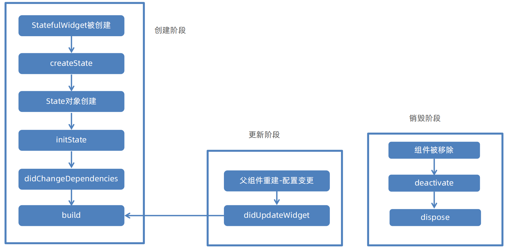
| 生命周期阶段 | 函数名 | 调用时机与核心任务 |
|---|---|---|
| 创建阶段 | createState() | Widget初始化调用,创建State对象 |
| initState() | State对象插入Widget树立刻执行,仅执行一次 | |
| didChangeDependencies() | initState后立刻执行,当所依赖的InheritedWidget更新时调用,可能多次 | |
| 构建与更新阶段 | build() | 构建UI方法,初始化或更新后多次调用 |
| didUpdateWidget() | 父组件传入新配置时调用,用于比较新旧配置 | |
| 销毁阶段 | deactiveate() | 当State对象从树中暂时移除时调用 |
| dispose() | 当State对象被永久移除时调用,释放资源,仅执行一次 |
class MainPage extends StatefulWidget {

  const MainPage({super.key});

  @override
  State<StatefulWidget> createState() {
    print("createState ---- 1");
    return _MainPageState();
  }

}

class _MainPageState extends State<MainPage> {

  @override
  void initState() {
    print("initState ---- 2");
    super.initState();
  }

  @override
  void didChangeDependencies() {
    print("didChangeDependencies ---- 3");
    super.didChangeDependencies();
  }

  @override
  void didUpdateWidget(covariant MainPage oldWidget) {
    print("didUpdateWidget ---- 5");
    super.didUpdateWidget(oldWidget);
  }

  @override
  void deactivate() {
    print("deactivate ---- 6");
    super.deactivate();
  }

  @override
  void dispose() {
    print("dispose ---- 7");
    super.dispose();
  }

  @override
  Widget build(BuildContext context) {
    print("build ---- 4");
    return MaterialApp(
      title: "Flutter Demo",
      theme: ThemeData(scaffoldBackgroundColor: Colors.blue),
      home: Scaffold(
        body: Center(
          child: Text("Hello Flutter"),
        )
      )
    );
  }
}
2.4.5 组件事件
用户与应用程序交互时触发的各种动作,比如触摸屏幕、滑动、点击等
- GestureDetector是 Flutter 中最常用、功能最丰富的手势检测组件。例如点击事件,仅需使用GestureDetector包裹被点击的元素,传入onTap方法即可
return MaterialApp(
    title: "Flutter Demo",
    theme: ThemeData(scaffoldBackgroundColor: Colors.blue),
    home: Scaffold(
        body: Center(
            child: GestureDetector(
                child: Text("Hello Flutter"),
                onTap: () {
                    print("onTap");
                },
            ),
        )
    )
);
- Flutter提供了多种方式为组件添加点击交互
| 组件类别 | 核心组件 | 主要特点/使用场景 |
|---|---|---|
| 专用按钮组件 | ElevatedButton、TextButton、OutlineButton、FloatingActionButton | 内置点击动画和样式,通过onPressed参数处理点击逻辑 |
| 视觉反馈组件 | InkWell | 提供点击事件(onTap),有MaterialDesign风格的水纹扩散效果 |
| 其他交互组件 | IconButton、Switch、Checkbox | 具有特定功能的交互式控件、点击事件(onPressed) |
2.4.6 状态更新setState
数据的变化要更新UI视图,需要执行setState方法,setState方法会造成build的重新执行
例如一个简单的计数器
class _MainPageState extends State<MainPage> {

  int _count = 0;

  @override
  Widget build(BuildContext context) {
    return MaterialApp(
      title: "Flutter Demo",
      theme: ThemeData(scaffoldBackgroundColor: Colors.white),
      home: Scaffold(
        appBar: AppBar(
          title: Text("Flutter Demo"),
          centerTitle: true,
        ),
        body: Center(
          child: Row(
            children: [
              TextButton(onPressed: () {
                setState(() {
                  _count--;
                });
              }, child: Text("Sub")),
              Text(_count.toString()),
              TextButton(onPressed: () {
                setState(() {
                  _count++;
                });
              }, child: Text("Add")),
            ],
          )
        ),
        bottomNavigationBar: Text("底部区域"),
      )
    );
  }
}
2.5 Flutter其他组件使用
2.5.1 布局组件
Flutter 提供了丰富强大的布局组件来构建各种用户界面
| 组件类别 | 核心组件 | 主要特点/使用场景 |
|---|---|---|
| 基础容器 | Container、Center、Align、Padding | 提供装饰、对齐、边距等基础样式和布局控制,是使用频率极高的组件 |
| 线性布局 | Row、Column | 在水平或垂直方向线性排列子组件,是构建界面的基础 |
| 弹性布局 | Flex, Expanded, Flexible | 按照比例分配剩余空间,实现自适应布局,常与 Row和 Column配合使用 |
| 层叠布局 | Stack, Positioned | 让子组件重叠堆叠,用于实现如图片上叠加文字、悬浮按钮等效果 |
| 流式布局 | Wrap, Flow | 当主轴空间不足时自动换行或换列,常用于标签、滤镜等动态宽高内容的排列 |
| 滚动布局 | ListView, GridView | 提供可滚动的列表或网格视图,高效展示大量数据 |
2.5.1.1 Container
Container 是功能丰富的布局组件,是一个多功能组合容器,可通过多种方式定义大小,有明确优先级规则。可以通过decoration属性实现视觉效果,但和color属性互斥,提供内外边距和对齐方式,支持绘制时进行矩阵变换,如旋转、倾斜、平移等
明确宽高>constraints约束>父组件约束>自适应组件大小
| 属性类别 | 关键属性 | 作用说明 |
|---|---|---|
| 布局定位 | alignment | 控制其 child(子组件)在容器内部的对齐方式。例如:Alignment.center(居中)、Alignment.topLeft(左上角) |
| 尺寸控制 | width/height/constraints | 设置容器的宽度和高度/为容器设置更复杂的尺寸约束(如最小/最大宽高) |
| 间距留白 | padding/margin | 容器内容与容器内边缘之间区域/设置容器外边缘与相邻组件之间区域 |
| 装饰效果 | color/decoration | 为容器设置一个简单的背景颜色/为容器设置复杂的背景装饰 |
| 变换效果 | transform | 对容器及其内容进行矩阵变换 |
| 子组件 | child | 容器内包含的唯一直接子组件 |
例如 实现下图的代码如下:
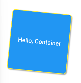
Container(
    width: 200,
    height: 200,
    // 居中
    alignment: Alignment.center,
    // 外边距
    margin: EdgeInsets.all(50),
    // 旋转弧度
    transform: Matrix4.rotationZ(0.1),
    decoration: BoxDecoration(
        color: Colors.blue,
        // 圆角
        borderRadius: BorderRadius.circular(10),
        // 边框
        border: Border.all(
            color: Colors.yellow,
            width: 2,
        ),
        // 阴影
        boxShadow: [
            BoxShadow(
                color: Colors.grey,
                offset: Offset(2, 2),
                blurRadius: 2,
            ),
        ],
    ),
    child: Text("Hello, Container", style: TextStyle(color: Colors.white, fontSize: 20)),
),
2.5.1.2 Center居中组件
Center组件将其子组件在父容器的空间内进行水平和垂直方向上的居中排列,实现效果为页面内容整体居中,如将一个登录表单或一个加载中的提示图标在页面正中显示
Center不能设置宽高,Center的最终大小取决于其父组件传递给它的约束, Center会向它的父组件申请尽可能大的空间
Center(
    child: Container(
        width: 100,
        height: 100,
        alignment: Alignment.center,
        color: Colors.blue,
        child: Text("居中内容", style: TextStyle(color: Colors.black)),
    ),
),
2.5.1.3 Align对齐组件
Align组件可以精确控制其子组件在父容器空间内的对齐位置,包括三个属性
- alignment(对齐方式):子组件在父容器内的对齐方式。
- widthFactor(宽度因子):Align的宽度将是子组件宽度乘以该因子
- heightFactor(高度因子):Align的高度将是子组件高度乘以该因子
当需要将一个组件放置在父容器的特定角落,Align是理想选择,通过 widthFactor和 heightFactor,可以创建出与子组件大小成比例的容器,动态布局中很有用
Center是 Align的一个特例,继承自 Align,相当于一个将 alignment属性为居中的Align.center
2.5.1.4 Padding内边距组件
Padding组件可以为其子组件添加内边距
| 属性 | 类型 | 作用说明 |
|---|---|---|
| padding | EdgeInsetsGeometry | 必需。定义内边距的大小和方向,通常使用 EdgeInsets类来设置 |
| child | Widget | 需要被添加内边距的子组件。 |
Container(
    // padding: EdgeInsets.all(20),
    // decoration: BoxDecoration(
    // color: Colors.amber,
    // ),
    color: Colors.amber,
    child: Padding(
        padding: EdgeInsets.symmetric(horizontal: 20, vertical: 10),	// 设置对称方向
        // padding: EdgeInsets.only(left: 40, top: 40),					// 设置四个边
        // padding: EdgeInsets.all(20),									// 设置所有方向
        child: Container(color: Colors.blue),
    ),
),
2.5.2 线性布局
2.5.2.1 Column
Column组件用于垂直排列其子组件的核心布局容器
| 属性 | 类型 | 作用说明 |
|---|---|---|
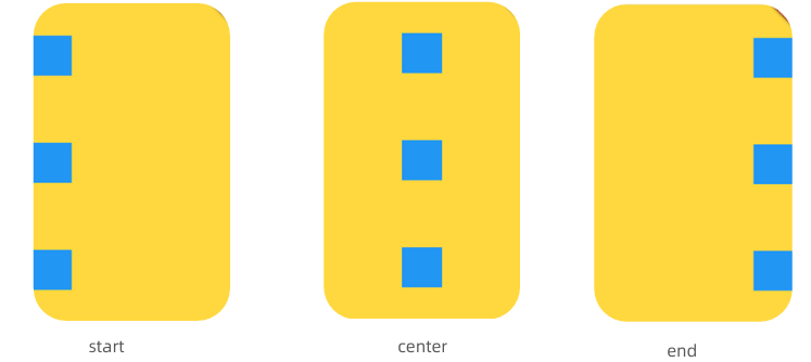
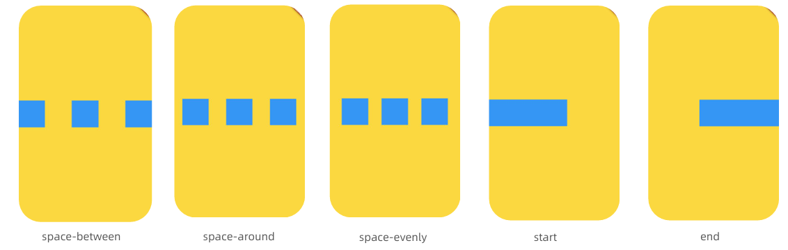
| mainAxisAlignment | MainAxisAlignment | 控制子组件在主轴(垂直方向)上的排列方式,如顶部对齐、居中或均匀分布 |
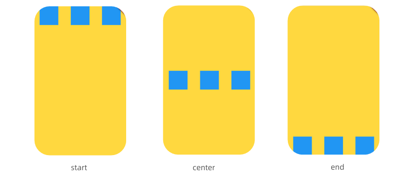
| crossAxisAlignment | CrossAxisAlignment | 控制子组件在交叉轴(水平方向)上的对齐方式,如左对齐、右对齐或拉伸填满 |
| mainAxisSize | MainAxisSize | 决定Column本身在垂直方向上的尺寸策略:是占满所有可用空间(max), 还是仅仅包裹子组件内容(min) |
| children | List<Widget> | 需要被垂直排列的子组件列表 |
主轴mainAxisAligment:
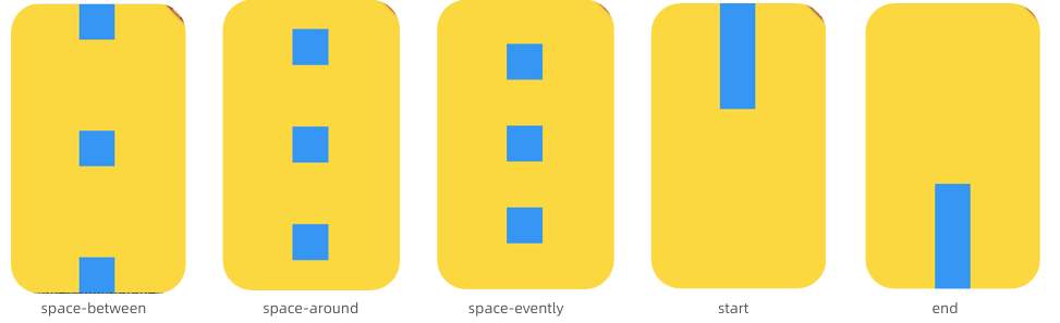
交叉轴crossAxisAlignment
Container(
    width: double.infinity,
    height: double.infinity,
    color: Colors.amber,
    child: Column(
        mainAxisAlignment: MainAxisAlignment.spaceBetween,
        children: [
            Container(color: Colors.blue, height: 100, width: 100,),
            Container(color: Colors.blue, height: 100, width: 100,),
            Container(color: Colors.blue, height: 100, width: 100,),
        ],
    )
),
- Column本身不支持滚动,如果内容超出,需要使用ListView或者SingleChildScrollView包裹
- 明确尺寸约束,父组件的大小直接影响Column的最终大小和子组件的布局行为
- 避免过度嵌套,过深的嵌套会影响性能并增加代码维护难度
2.5.2.2 Row
Row组件用于水平排列其子组件的核心布局容器
| 属性 | 类型 | 作用说明 |
|---|---|---|
| mainAxisAlignment | MainAxisAlignment | 控制子组件在主轴(水平方向)上的排列方式,如顶部对齐、居中或均匀分布 |
| crossAxisAlignment | CrossAxisAlignment | 控制子组件在交叉轴(垂直方向)上的对齐方式,如左对齐、右对齐或拉伸填满 |
| mainAxisSize | MainAxisSize | 决定Row本身在水平方向上的尺寸策略:是占满所有可用空间(max), 还是仅仅包裹子组件内容(min) |
| children | List<Widget> | 需要被水平排列的子组件列表 |
设置主轴mainAxisAligment
设置交叉轴crossAxisAlignment
- Row本身不支持滚动,如果内容超出,需要使用ListView或者SingleChildScrollView包裹
- 明确尺寸约束,父组件的大小直接影响Row的最终大小和子组件的布局行为
- 避免过度嵌套,过深的嵌套会影响性能并增加代码维护难度
2.5.3 弹性布局Flex
Flex布局允许沿一个主轴(水平或垂直)排列其子组件,灵活地控制这些子组件在主轴上的尺寸比例和空间分配,Flex是Column和Row的结合体,Flex的子组件常使用Expanded或Flexible来控制空间分配
| 属性 | 类型 | 作用说明 |
|---|---|---|
| direction | Axis.horizontal/Axis.vertical | 主轴方向,决定子组件的排列方向 |
| mainAxisAlignment | MainAxisAlignment | 子组件在主轴方向上的对齐方式 |
| crossAxisAlignment | CrossAxisAlignment | 子组件在交叉轴方向上的对齐方式 |
| mainAxisSize | MainAxisSize | Flex 容器自身在主轴上的尺寸策略 |
Container(
  width: double.infinity,
  height: double.infinity,
  color: Colors.amber,
  child: Flex(
      direction: Axis.horizontal,
      children: [
          Expanded(
              flex: 2,
              child: Container(color: Colors.red, height: 100, width: 100),
          ),
          Expanded(
              flex: 1,
              child: Container(color: Colors.green, height: 100, width: 100),
          ),
      ],
  ),
),
- Flex 布局受其父组件传递的约束影响。确保父组件提供了适当的布局约束
- Expanded 与 Flexible 的区别: Expanded强制子组件填满所有剩余空间, Flexible根据自身大小调整,不强制占满空间
2.5.4 流式布局Wrap
流式布局组件,当子组件在主轴方向上排列不下时,它会自动换行(或换列)
Column/Row/Flex内容超出均不会换行
| 属性 | 常用值 | 作用说明 |
|---|---|---|
| direction | Axis.horizontal(水平)/Axis.vertical(垂直) | 设置主轴方向,即排列方向 |
| spacing | 数值 | 主轴方向上,子组件之间的间距 |
| runSpacing | 数值 | 交叉轴方向上,行(或列)之间的间距 |
| alignment | WrapAlignment | 子组件在主轴方向上的对齐方式 |
| runAlignment | WrapAlignment | 交叉轴方向上的对齐方式 |
当子组件内容是根据数据动态生成时,使用 Wrap 可以确保布局始终适配
Container(
    width: double.infinity,
    height: double.infinity,
    color: Colors.amber,
    child: Wrap(
        direction: Axis.horizontal,
        spacing: 10,
        runSpacing: 10,
        children: List.generate(
            15,
            (index) => Container(
                margin: EdgeInsets.all(10),
                color: Colors.blue,
                height: 100,
                width: 100,
            ),
        ),
    ),
),
2.5.5 层叠布局Stack/Positioned
层叠布局组件,允许你将多个子组件按照 Z 轴(深度方向)进行叠加排列。
| 属性 | 类型 | 作用说明 |
|---|---|---|
| alignment | AlignmentGeometry | 控制非定位子组件在Stack内的对齐方式,默认左上角 |
| fit | StackFit | 控制非定位子组件如何适应Stack的尺寸 |
| clipBehavior | Clip | 控制子组件超出Stack边界时的裁剪方式 |
| children | List<Widget> | 需要被层叠排列的子组件列表 |
Positioned必须作为 Stack的直接子组件,Positioned通过left、right、top、bottom 来将子组件“钉”在 Stack的某个角落或边缘
Container(
    width: double.infinity,
    height: double.infinity,
    color: Colors.amber,
    child: Stack(
        children: [
            Container(width: 200, height: 200, color: Colors.grey),
            Positioned(
                left: 10,
                top: 10,
                child: Container(width: 50, height: 50, color: Colors.red),
            ),
            Positioned(
                right: 10,
                bottom: 10,
                child: Container(width: 50, height: 50, color: Colors.blue),
            ),
        ],
    ),
),
2.5.6 文本组件Text
Text组件是在用户界面中显示文本的基础组件
| 属性 | 类型 | 作用说明 |
|---|---|---|
| data | String | 必需。要显示的文本内容 |
| style | TextStyle | 文本样式,可设置颜色、大小、粗细等 |
| textAlign | TextAlign | 文本在容器内的水平对齐方式,如left, center |
| maxLines | int | 文本显示的最大行数 |
Text(
    "这是一个文本这是一个文本这是一个文本这是一个文本这是一个文本这是一个文本这是一个文本",
    style: TextStyle(
        fontSize: 30,
        color: Colors.blue,
        fontStyle: FontStyle.italic,
        fontWeight: FontWeight.w900,
        decoration: TextDecoration.underline,
        decorationColor: Colors.red,
    ),
    maxLines: 2,
    overflow: TextOverflow.ellipsis,
),
如果需要在同一段文本中显示不同样式,可用Text.rich构造函数配合TextSpan来实现
Text.rich(
    TextSpan(
        text: "Hello ",
        children: [
            TextSpan(
                text: "World",
                style: TextStyle(
                    fontSize: 30,
                    color: Colors.blue,
                    fontWeight: FontWeight.w900,
                ),
            ),
        ],
        style: TextStyle(
            fontSize: 30,
            color: Colors.red,
            fontWeight: FontWeight.w900,
        ),
    ),
),
2.5.7 图片组件Image
在用户界面中显示图片的核心部件,包括
Image.asset():加载项目资源目录(assets)中的图片。需要在 pubspec.yaml文件中声明资源路径Image.network():直接从网络地址加载图片Image.file():加载设备本地存储中的图片文件Image.memory():加载内存中的图片数据
| 分类 | 类型 | 作用说明 |
|---|---|---|
| width/ height | double | 设置图片显示区域的宽度和高度 |
| fit | BoxFit | 控制图片如何适应其显示区域,例如是否拉伸、裁剪或保持原比例 |
| alignment | AlignmentGeometry | 图片在其显示区域内的对齐方式,如 Alignment.center |
| repeat | ImageRepeat | 当图片小于显示区域时,设置是否以及如何重复平铺图片 |
配置pubspec.yaml
flutter:
  assets:
  - lib/images/
在代码中使用
Image.asset(
    "lib/images/avator.jpg",
    width: 200,
    height: 200,
    fit: BoxFit.cover,
),
Android/HarmonyOS/iOS使用Image.network需要配置网络权限
2.5.8 文本输入组件TextField
实现文本输入功能的核心组件
| 属性 | 作用说明 |
|---|---|
| controller | 文本编辑器控制器,用于获取、设置文档内容及监听变化 |
| decortation | 输入框的外观、如标签、提示文字、图标、边框等 |
| style | 定义输入文本的样式 |
| maxLines | 最大行数 |
| onChanged | 输入内容发生变化时执行的回调函数 |
| onSubmitted | 用户提交输入时的回调函数 |
class _MainPageState extends State<MainPage> {

  final TextEditingController _usernameController = TextEditingController();
  final TextEditingController _passwordController = TextEditingController();

  @override
  Widget build(BuildContext context) {
    return MaterialApp(
      title: "登陆",
      theme: ThemeData(scaffoldBackgroundColor: Colors.white),
      home: Scaffold(
        appBar: AppBar(title: Text("Flutter Demo"), centerTitle: true),
        body: Container(
          width: double.infinity,
          height: double.infinity,
          alignment: Alignment.center,
          padding: EdgeInsets.all(20),
          child: Column(
            children: [
              TextField(
                controller: _usernameController,
                onSubmitted: (value) {
                  print("用户名:$value");
                },
                decoration: InputDecoration(
                  hintText: "请输入用户名",
                  fillColor: Color.fromARGB(255, 222, 219, 207),
                  filled: true,
                  border: OutlineInputBorder(
                    borderSide: BorderSide.none,
                    borderRadius: BorderRadius.circular(10),
                  ),
                ),
              ),
              SizedBox(height: 20),
              TextField(
                controller: _passwordController,
                onSubmitted: (value) {
                  print("密码:$value");
                },
                obscureText: true, // 密码是否可见
                decoration: InputDecoration(
                  hintText: "请输入密码",
                  fillColor: Color.fromARGB(255, 222, 219, 207),
                  filled: true,
                  border: OutlineInputBorder(
                    borderSide: BorderSide.none,
                    borderRadius: BorderRadius.circular(10),
                  ),
                ),
              ),
              SizedBox(height: 20),
              ElevatedButton(
                style: ElevatedButton.styleFrom(
                  backgroundColor: Colors.black,
                  shape: RoundedRectangleBorder(
                    borderRadius: BorderRadius.circular(10),
                  ),
                ),
                child: Text("登陆", style: TextStyle(color: Colors.white)),
                onPressed: () {
                  String username = _usernameController.text;
                  String password = _passwordController.text;
                  print("用户名:$username,密码:$password");
                },
              ),
            ],
          ),
        ),
        bottomNavigationBar: Text("底部区域"),
      ),
    );
  }
}
2.5.9 滚动组件
| 组件 | 特点 | 使用场景 |
|---|---|---|
| SingleChildScrollView | 让单个子组件可以用滚动,所有内容一次性渲染 | 长表单、设置页、内容不固定但是总量不多的页面 |
| ListView | 线性列表,通过builder可以实现懒加载,性能优异 | 聊天记录、新闻、常见的单列滚动的数据列表 |
| GridView | 网格布局列表,支持懒加载,可以固定列数 | 图片墙、商品网格、应用图标列表 |
| CustomScrollView | 复杂布局方案,通过组合多个Sliver组件实现滚动 | 电商首页、社交App个人主页多个滚动紧密联动 |
| PageView | 整页滚动效果,支持横向和纵向 | 应用引导页、图片轮播图、书籍翻页 |
2.5.9.1 SingleChildScrollView
SingleChildScrollView可以包裹一个子组件,让单个子组件具备滚动能力。
- 只能包含一个子组件,如果滚动多个组件,通常将其嵌套在Column或Row组件中
- 通过 scrollDirection属性控制,默认为垂直方向 (Axis.vertical),也可设置为水平方向 (Axis.horizontal)
- 一次性构建所有子组件,如果嵌套的 Column或 Row中包含大量子项,可能会导致性能问题,建议使用 ListView
- 绑定一个ScrollController对象给controller对象,使用animateTo/jumpTo方法控制滚动
Stack(
    children: [
        SingleChildScrollView(
            controller: _scrollController,
            padding: EdgeInsets.all(10),
            child: Column(
                children: List.generate(
                    100,
                    (index) => Container(
                        height: 100,
                        margin: EdgeInsets.symmetric(vertical: 5),
                        alignment: Alignment.center,
                        width: double.infinity,
                        color: Colors.blue,
                        child: Text(
                            "第${index + 1}项",
                            style: TextStyle(color: Colors.white, fontSize: 30),
                        ),
                    ),
                ),
            ),
        ),
        Positioned(
            bottom: 0,
            right: 0,
            child: GestureDetector(
                onTap: () {
                    _scrollController.animateTo(
                        0,
                        duration: Duration(milliseconds: 500),
                        curve: Curves.ease,
                    );
                },
                child: Container(
                    height: 80,
                    width: 80,
                    alignment: Alignment.center,
                    decoration: BoxDecoration(
                        color: Colors.red,
                        borderRadius: BorderRadius.circular(40),
                    ),
                    child: Text(
                        "去顶部",
                        style: TextStyle(color: Colors.white, fontSize: 20),
                    ),
                ),
            ),
        ),
        Positioned(
            top: 0,
            right: 0,
            child: GestureDetector(
                onTap: () {
                    _scrollController.animateTo(
                        _scrollController.position.maxScrollExtent,
                        duration: Duration(milliseconds: 500),
                        curve: Curves.ease,
                    );
                },
                child: Container(
                    height: 80,
                    width: 80,
                    alignment: Alignment.center,
                    decoration: BoxDecoration(
                        color: Colors.red,
                        borderRadius: BorderRadius.circular(40),
                    ),
                    child: Text(
                        "去底部",
                        style: TextStyle(color: Colors.white, fontSize: 20),
                    ),
                ),
            ),
        ),
    ],
),
2.5.9.2 ListView
ListView用于构建可滚动列表的核心部件,并提供流畅滚动体验
- 提供多种构造函数,如默认构造函数、ListView.builder、ListView.separated,适用于静态数量有限数据一次性构建所有表项
- 采用按需渲染(懒加载),只构建当前可见区域的列表项,极大提升长列表性能
默认构造函数,适用于静态数量有限数据一次性构建所有表项:
ListView(
    controller: _scrollController,
    padding: EdgeInsets.all(10),
    children: List.generate(
        100,
        (index) => Container(
            height: 100,
            alignment: Alignment.center,
            margin: EdgeInsets.only(bottom: 10),
            color: Colors.blue,
            child: Text("item $index", style: TextStyle(color: Colors.white, fontSize: 20),),
        ),
    ),
),
builder模式,处理长列表或动态数据的首选和推荐方式,它的页面渲染方式为按需构建,不会在初始化时将所有列表项都创建,而是根据用户的滚动行为,动态地创建和销毁列表项:
ListView.builder(
    controller: _scrollController,
    padding: EdgeInsets.all(10),
    itemCount: 100,
    itemBuilder: (BuildContext context, int index) {
        return Container(
            height: 100,
            alignment: Alignment.center,
            margin: EdgeInsets.only(bottom: 10),
            color: Colors.blue,
            child: Text("item $index", style: TextStyle(color: Colors.white, fontSize: 20),),
        );
    },
),
separated模式,在 ListView.builder的基础上,额外提供了构建分割线的能力:
ListView.separated(
    controller: _scrollController,
    padding: EdgeInsets.all(10),
    separatorBuilder: (BuildContext context, int index) {
        return Container(
            height: 10,
            color: Colors.yellow,
        );
    },
    itemCount: 100,
    itemBuilder: (BuildContext context, int index) {
        return Container(
            height: 100,
            alignment: Alignment.center,
            color: Colors.blue,
            child: Text("item $index", style: TextStyle(color: Colors.white, fontSize: 20),),
        );
    },
),
2.5.9.3 GridView
GridView用于创建二维可滚动网格布局的核心组件,提供多种构建方式,GridView.count、GridView.extent、GridView.builder等
GridView.count基于固定列数的网格布局,指定网格多少列,Flutter 自动计算列的宽度,在空间内均匀排列:
GridView.count(
    controller: _scrollController,
    crossAxisCount: 3,
    mainAxisSpacing: 10,
    crossAxisSpacing: 10,
    padding: EdgeInsets.all(10),
    children: List.generate(100, (index) {
        return Container(
            height: 100,
            alignment: Alignment.center,
            color: Colors.blue,
            child: Text("item $index", style: TextStyle(color: Colors.white, fontSize: 20),),
        );
    }),
),
GridView.extent基于固定子项最大宽度/高度的网格布局,通过maxCrossAxisExtent设置子项最大宽度/高度来计算横向或者纵向有多少列:
GridView.extent(
    controller: _scrollController,
    scrollDirection: Axis.vertical,
    maxCrossAxisExtent: 100,
    mainAxisSpacing: 10,
    crossAxisSpacing: 10,
    padding: EdgeInsets.all(10),
    children: List.generate(100, (index) {
        return Container(
            height: 100,
            alignment: Alignment.center,
            color: Colors.blue,
            child: Text("item $index", style: TextStyle(color: Colors.white, fontSize: 20),),
        );
    }),
),
GridView.builder用于网格项数量巨大或动态生成的情况,需要接收gridDelegate布局委托托、itemBuilder构建函数、itemCount构建数量:
GridView.builder(
    controller: _scrollController,
    scrollDirection: Axis.vertical,
    itemCount: 100,
    padding: EdgeInsets.all(10),
    gridDelegate: SliverGridDelegateWithFixedCrossAxisCount(
        crossAxisCount: 4,
        mainAxisSpacing: 10,
        crossAxisSpacing: 10,
        childAspectRatio: 2,
    ),
    itemBuilder: (BuildContext context, int index) => Container(
        height: 100,
        alignment: Alignment.center,
        color: Colors.blue,
        child: Text(
            "item $index",
            style: TextStyle(color: Colors.white, fontSize: 20),
        ),
    ),
),
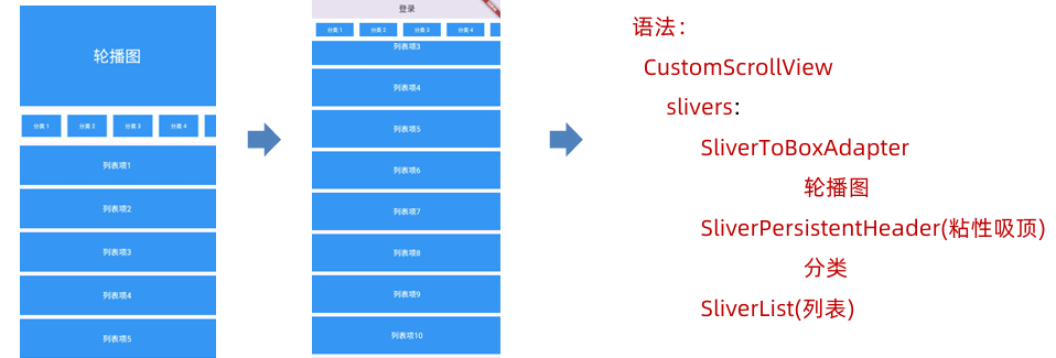
2.5.9.4 CustomScrollView
CustomScrollView用于组合多个可滚动组件(如列表、网格),实现统一协调的滚动效果,通过 slivers属性接收一个Sliver组件列表
Sliver是Flutter 中描述可滚动视图内部一部分内容的组件,它是滚动视图的"切片"
Sliver组件对应关系如下:
- SliverList:ListView
- SliverGrid:GridView
- SliverAppBar:AppBar
- SliverPadding:Padding
- SliverToBoxAdapter:ToBoxAdapter (用于包裹普通 Widget)
- SliverPersistentHeader(粘性吸顶)
import 'package:flutter/material.dart';

void main(List<String> args) {
  runApp(MainPage());
}

class MainPage extends StatefulWidget {
  const MainPage({super.key});

  @override
  State<StatefulWidget> createState() {
    return _MainPageState();
  }
}

class _MainPageState extends State<MainPage> {
  @override
  Widget build(BuildContext context) {
    return MaterialApp(
      title: "首页",
      theme: ThemeData(scaffoldBackgroundColor: Colors.white),
      home: Scaffold(
        appBar: AppBar(title: Text("Flutter Demo"), centerTitle: true),
        body: CustomScrollView(
          slivers: [
            SliverToBoxAdapter(
              child: Container(
                height: 150,
                alignment: Alignment.center,
                color: Colors.blue,
                child: Text(
                  "轮播图",
                  style: TextStyle(color: Colors.white, fontSize: 20),
                ),
              ),
            ),
            SliverToBoxAdapter(child: SizedBox(height: 10)),
            SliverPersistentHeader(
              delegate: _StickyCategoryDelegate(),
              pinned: true,
            ),
            SliverList.separated(
              separatorBuilder: (context, index) => SizedBox(height: 10),
              itemCount: 100,
              itemBuilder: (context, index) {
                return Container(
                  height: 50,
                  alignment: Alignment.center,
                  color: Colors.blue,
                  child: Text(
                    "分类$index",
                    style: TextStyle(color: Colors.white, fontSize: 20),
                  ),
                );
              },
            ),
          ],
        ),
        bottomNavigationBar: Text("底部区域"),
      ),
    );
  }
}

class _StickyCategoryDelegate extends SliverPersistentHeaderDelegate {
  @override
  bool shouldRebuild(covariant SliverPersistentHeaderDelegate oldDelegate) {
    return false;
  }

  @override
  Widget build(
    BuildContext context,
    double shrinkOffset,
    bool overlapsContent,
  ) {
    return Container(
      color: Colors.white,
      child: ListView.builder(
        itemCount: 30,
        scrollDirection: Axis.horizontal,
        itemBuilder: (context, index) {
          return Container(
            color: Colors.blue,
            width: 100,
            alignment: Alignment.center,
            margin: EdgeInsets.symmetric(horizontal: 10),
            child: Text(
              "分类$index",
              style: TextStyle(color: Colors.white, fontSize: 20),
            ),
          );
        },
      ),
    );
  }

  @override
  double get maxExtent => 100; // 最大展开区高度

  @override
  double get minExtent => 60; // 最小折叠区高度
}
2.5.9.5 PageView
PageView用于实现分页滚动视图的核心组件,支持懒加载(按需渲染)
实现一个轮播图组件:
class _MainPageState extends State<MainPage> {
  final PageController _pageController = PageController(initialPage: 0);

  int _currentIndex = 0;

  @override
  Widget build(BuildContext context) {
    return MaterialApp(
      title: "首页",
      theme: ThemeData(scaffoldBackgroundColor: Colors.white),
      home: Scaffold(
        appBar: AppBar(title: Text("Flutter Demo"), centerTitle: true),
        body: CustomScrollView(
          slivers: [
            SliverToBoxAdapter(
              child: Stack(
                children: [
                  Container(
                    height: 150,
                    alignment: Alignment.center,
                    color: Colors.blue,
                    child: PageView.builder(
                      itemCount: 10,
                      controller: _pageController,
                      scrollDirection: Axis.horizontal,
                      itemBuilder: (context, index) {
                        return Container(
                          color: Colors.blue,
                          width: 100,
                          alignment: Alignment.center,
                          margin: EdgeInsets.symmetric(horizontal: 10),
                          child: Text(
                            "轮播图$index",
                            style: TextStyle(color: Colors.white, fontSize: 20),
                          ),
                        );
                      },
                    ),
                  ),
                  Positioned(
                    bottom: 0,
                    left: 0,
                    right: 0,
                    height: 20,
                    child: Row(
                      mainAxisAlignment: MainAxisAlignment.center,
                      children: List.generate(
                        10,
                        (index) => GestureDetector(
                          onTap: () {
                            setState(() {
                              _currentIndex = index;
                            });
                            _pageController.animateToPage(
                              index,
                              duration: Duration(milliseconds: 300),
                              curve: Curves.ease,
                            );
                          },
                          child: Container(
                            width: 10,
                            height: 10,
                            margin: EdgeInsets.symmetric(horizontal: 5),
                            decoration: BoxDecoration(
                              color: _currentIndex == index ? Colors.red : Colors.white,
                              borderRadius: BorderRadius.circular(5),
                            ),
                          ),
                        ),
                      ),
                    ),
                  ),
                ],
              ),
            ),
          ],
        ),
      ),
    );
  }
}
2.6 组件通信
组件通信方式有如下几种:
| 通信方式 | 方向 | 适用场景 |
|---|---|---|
| 构造函数传递 | 父 =>子 | 简单的数据传递 |
| 回调函数 | 子=>父 | 子组件通知父组件 |
| InheritedWidget | 祖先=>后代 | 跨层级数据共享 |
| Provider | 任意组件间 | 状态管理推荐方案 |
| EventBus | 任意组件间 | 全局事件通信 |
| Bloc/Riverpod | 任意组件间 | 复杂状态管理 |
2.6.1 构造函数传参
父传子可以使用构造函数传参数,使用步骤如下
- 子组件定义接收属性
- 子组件在构造函数中接收参数
- 父组件传递属性给子组件
- 有状态组件在对外的类接收属性,对内的类通过widget对象获取对应属性
子组件定义接收属性需要使用final关键字,因为属性由父组件决定,子组件不能随意更改
无状态组件:
class Child extends StatelessWidget {

  final String title;

  const Child({super.key, this.title = "子组件消息"});

  @override
  Widget build(BuildContext context) {
    return Text("子组件$title", style: TextStyle(fontSize: 20, color: Colors.red));
  }
}
有状态组件:
class Child extends StatefulWidget {

  final String title;

  const Child({super.key, this.title = "子组件消息"});

  @override
  State<StatefulWidget> createState() {
    return _ChildState();
  }
}

class _ChildState extends State<Child> {
  @override
  Widget build(BuildContext context) {
    return Text("子组件${widget.title}", style: TextStyle(fontSize: 20, color: Colors.red));
  }
}
2.6.2 回调函数
子传父可以使用回调函数,使用步骤如下
- 父组件传递一个函数给子组件
- 子组件调用该函数
- 父组件通过回调函数获取参数
class Child extends StatefulWidget {
  final String title;
  final Function(String)? onClick;

  const Child({super.key, this.title = "子组件消息", this.onClick});

  @override
  State<StatefulWidget> createState() {
    return _ChildState();
  }
}

class _ChildState extends State<Child> {
  @override
  Widget build(BuildContext context) {
    return Container(
      alignment: Alignment.center,
      padding: EdgeInsets.all(10),
      decoration: BoxDecoration(
        color: Colors.blue,
        borderRadius: BorderRadius.circular(10),
      ),
      child: TextButton(
        onPressed: () {
          widget.onClick?.call(widget.title);
        },
        child: Text(
          "子组件${widget.title}",
          style: TextStyle(fontSize: 20, color: Colors.white),
        ),
      ),
    );
  }
}
2.7 网络请求
网络请求是Flutter移动应用开发的核心功能,最常用的网络请求工具是使用Dio插件
安装dio
flutter pub add dio
基本使用: Dio().get(url).then().catchError()
一般情况下,在初始化状态initState获取页面数据
封装工具类如下:
import 'package:dio/dio.dart';

class DioUtils {
  final Dio _dio = Dio();

  DioUtils() {
    // _dio.options.baseUrl = "https://www.baidu.com";
    // _dio.options.sendTimeout = const Duration(seconds: 10);       // 发送超时时间
    // _dio.options.connectTimeout = const Duration(seconds: 10);    // 连接超时时间
    // _dio.options.receiveTimeout = const Duration(seconds: 10);    // 接收超时时间
    _dio.options
      ..baseUrl = "https://www.baidu.com"
      ..connectTimeout = const Duration(seconds: 10)
      ..receiveTimeout = const Duration(seconds: 10)
      ..sendTimeout = const Duration(seconds: 10);

    _addInterceptors(); // 添加拦截器
  }

  void _addInterceptors() {
    _dio.interceptors.add(
      InterceptorsWrapper(
        onRequest: (ctx, handler) {
          // 在发送请求之前做一些事情
          // handler.reject(e); // 拒绝请求
          return handler.next(ctx); // 继续发送请求
        },
        onResponse: (response, handler) {
          // 在收到响应之前做一些事情
          if (response.statusCode! >= 200 && response.statusCode! < 300) {
            // 处理成功响应
            return handler.next(response); // 继续处理响应
          }
          // 处理错误响应
          return handler.reject(
            DioException(requestOptions: response.requestOptions),
          );
        },
        onError: (DioException e, handler) {
          // 在发生错误之前做一些事情
          handler.reject(e);
        },
      ),
    );
  }

  Future<T> request<T>(
    String path, {
    String method = "GET",
    Map<String, dynamic>? queryParameters,
    Map<String, dynamic>? data,
    Options? options,
  }) async {
    Response<T> response = await _dio.request<T>(
      path,
      queryParameters: queryParameters,
      data: data,
      options: options,
    );
    return response.data!;
  }

  Future<T> get<T>(
    String path, {
    Map<String, dynamic>? queryParameters,
    Options? options,
  }) async {
    return await request<T>(
      path,
      method: "GET",
      queryParameters: queryParameters,
      options: options,
    );
  }

  Future<T> post<T>(
    String path, {
    Map<String, dynamic>? queryParameters,
    Map<String, dynamic>? data,
    Options? options,
  }) async {
    return await request<T>(
      path,
      method: "POST",
      queryParameters: queryParameters,
      data: data,
      options: options,
    );
  }
}
默认情况下, flutter 运行 web 端加载网络资源会报跨域提示错误。
可以在flutter/packages/flutter_tools/lib/src/web/chrome.dart,添加 --disable-web-security,然后删除flutter/bin/cache/下 flutter_tools.snaphot和flutter_tools.stamp,执行下面重新运行项目即可
flutter doctor -v
2.8 路由管理
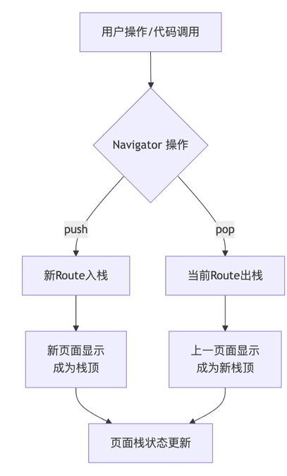
路由管理是构建多页面应用的核心,它通过 Navigator 和 Route 来管理页面栈,实现页面跳转和返回
2.8.1 基本路由
基本路由适合页面不多、跳转逻辑简单的场景,无需提前注册路由,跳转时创建 MaterialPageRoute实例即可
- 跳转新页面:
Navigator.push(BuildContext context, Route route) - 返回上一页:
Navigator.pop(BuildContext context)
MaterialApp是路由系统的组件,只能有一个MaterialApp包裹
class ListPage extends StatefulWidget {
  ListPage({Key? key}) : super(key: key);

  @override
  _ListPageState createState() => _ListPageState();
}

class _ListPageState extends State<ListPage> {
  @override
  Widget build(BuildContext context) {
    return Scaffold(
      appBar: AppBar(title: Text("列表页"), centerTitle: true),
      body: ListView.builder(
        itemCount: 100,
        itemBuilder: (context, index) {
          return GestureDetector(
            onTap: () {
              print("点击了列表项$index");
              Navigator.push(context, MaterialPageRoute(builder: (context) {
                return DetailPage(index: index);
              }));
            },
            child: Container(
              color: Colors.blue,
              height: 50,
              alignment: Alignment.center,
              margin: EdgeInsets.all(10),
              child: Text("列表项$index", style: TextStyle(fontSize: 20)),
            ),
          );
        },
      ),
    );
  }
}

class DetailPage extends StatelessWidget {
  final int index;

  const DetailPage({super.key, required this.index});

  @override
  Widget build(BuildContext context) {
    return Scaffold(
      appBar: AppBar(title: Text("详情页$index"), centerTitle: true),
      body: Container(
        color: Colors.red,
        height: 50,
        alignment: Alignment.center,
        margin: EdgeInsets.all(10),
        child: TextButton(
          onPressed: () {
            Navigator.pop(context);
          },
          child: Text("返回", style: TextStyle(fontSize: 20)),
        ),
      ),
    );
  }
}
2.8.2 命名路由
应用页面增多后,使用命名路提升代码可维护性,需要先在 MaterialApp中注册一个路由表(routes)并设置initialRoute(首页)
跳转的方法包括:
| 方法 | 核心作用 | 使用场景 | 典型场景 |
|---|---|---|---|
| pushNamed | 进入新页面 | [A, B]→ [A, B, C] | 常规页面跳转,如列表页进入详情页 |
| pushReplacementNamed | 替换当前页面 | [A, B]→ [A, C] | 登录成功后跳转主页,并无法返回登录页 |
| pushNamedAndRemoveUntil | 跳转新页面并清理栈 | [A, B, C, D]→ [A, E] | 退出登录后跳转登录页,并清空所有历史页面 |
| popAndPushNamed | 返回并立即跳转新页面 | [A, B, C]→ [A, B, D] | 购物车页面结算后,返回商品列表并同时跳转到订单页 |
| popUntil | 连续返回直到条件满足 | [A, B, C, D]→ [A, B] | 从设置页的深层级,一键返回到主设置页面 |
- 传递参数可以使用
Navigator.pushNamed(context, url, arguments: { 参数 }) - 接收参数可以使用
ModalRoute.of(context)?.settings.arguments
class _MainPageState extends State<MainPage> {
  @override
  Widget build(BuildContext context) {
    return MaterialApp(
      title: "首页",
      theme: ThemeData(scaffoldBackgroundColor: Colors.white),
      routes: {
        "/detail": (context) => _DetailPage(),
        "/list": (context) => ListPage(),
      },
      initialRoute: "/list",
      home: Scaffold(
        appBar: AppBar(title: Text("Flutter Demo"), centerTitle: true),
        body: ListPage(),
      ),
    );
  }
}

class ListPage extends StatefulWidget {
  ListPage({Key? key}) : super(key: key);

  @override
  _ListPageState createState() => _ListPageState();
}

class _ListPageState extends State<ListPage> {
  @override
  Widget build(BuildContext context) {
    return Scaffold(
      appBar: AppBar(title: Text("列表页"), centerTitle: true),
      body: ListView.builder(
        itemCount: 100,
        itemBuilder: (context, index) {
          return GestureDetector(
            onTap: () {
              print("点击了列表项$index");
              // Navigator.push(context, MaterialPageRoute(builder: (context) {
              //   return DetailPage(index: index);
              // }));
              Navigator.pushNamed(context, "/detail", arguments: index);
            },
            child: Container(
              color: Colors.blue,
              height: 50,
              alignment: Alignment.center,
              margin: EdgeInsets.all(10),
              child: Text("列表项$index", style: TextStyle(fontSize: 20)),
            ),
          );
        },
      ),
    );
  }
}

class _DetailPage extends StatefulWidget {

  _DetailPage({Key? key}) : super(key: key);

  @override
  __DetaiState createState() => __DetaiState();
}


class __DetaiState extends State<_DetailPage> {

  int? _index;

  @override
  void initState() {
    super.initState();
    Future.microtask(() {
      if (mounted) {
        _index = ModalRoute.of(context)?.settings.arguments as int?;
        setState(() {});
      }
    });
  }

  @override
  Widget build(BuildContext context) {
    return Scaffold(
      appBar: AppBar(
        title: Text("详情页$_index"),
        centerTitle: true,
      ),
      body: Container(
        color: Colors.red,
        height: 50,
        alignment: Alignment.center,
        margin: EdgeInsets.all(10),
        child: TextButton(
          onPressed: () {
            // Navigator.pop(context);
            Navigator.pushNamed(context, "/list");
          },
          child: Text("返回", style: TextStyle(fontSize: 20)),
        ),
      ),
    );
  }
}
注意,initState获取不到路由参数(路由算InheritedWidget跨层级传递,需在didChangeDependencies才能拿到),若需initState的话,需放置在Future.microtask(异步微任务)中
2.8.3 动态路由与高级控制
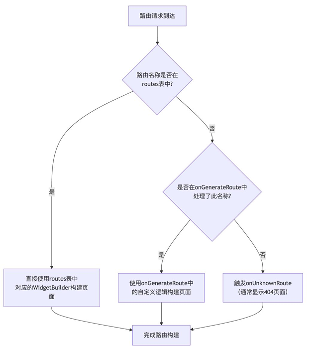
更复杂的场景,如需根据参数动态生成页面,或实现路由拦截,可以使用onGenerateRoute和onUnknownRoute
class _MainPageState extends State<MainPage> {
  @override
  Widget build(BuildContext context) {
    return MaterialApp(
      title: "首页",
      theme: ThemeData(scaffoldBackgroundColor: Colors.white),
      routes: {
        "/list": (context) => ListPage(),
      },
      onGenerateRoute: (settings) {
        if (settings.name == "/detail") {
          return MaterialPageRoute(builder: (context) {
            bool isLogin = false;
            if (!isLogin) {
              return LoginPage();
            }
            return _DetailPage();
          });
        }
      },
      onUnknownRoute: (settings) {
        return MaterialPageRoute(builder: (context) {
          return Scaffold(
            appBar: AppBar(title: Text("404"), centerTitle: true),
            body: Container(
              color: Colors.red,
              height: 50,
              alignment: Alignment.center,
              margin: EdgeInsets.all(10),
              child: Text("404", style: TextStyle(fontSize: 20)),
            ),
          );
        });
      },
      initialRoute: "/list",
      home: Scaffold(
        appBar: AppBar(title: Text("Flutter Demo"), centerTitle: true),
        body: ListPage(),
      ),
    );
  }
}
评论